As pleased as I was with my little sketch, this lady has a better way of doing it:
https://expeditionaryart.com/blog/2018/11/autumn-inspiration/
I'm definitely going to try it. I've tried the technique of masking with packing tape before and it does work.
Saturday
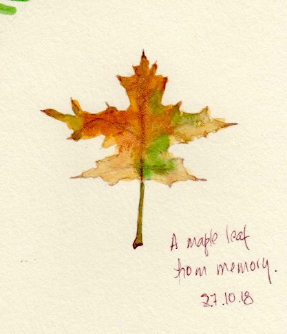
Fall Is Over
The freaky weather ruined the fall this year. I had to paint this leaf from memory. I love painting maple leaves -- the colours are so beautiful and rich.

Sunday
Trevor Waugh's Book Has Arrived
People in Watercolour is the title of Trevor Waugh's nice little book and I have started doing some of the exercises in it.
I'm surprised how well they turned out. And it's true that with pictures that small you'd be foolish to attempt to add details!
I'm surprised how well they turned out. And it's true that with pictures that small you'd be foolish to attempt to add details!
 |
| Click to enlarge. |
Tuesday
The Inverted U Approach for People
When it comes to watercolour painting,
I call myself a "perpetual student" but what I am, in fact,
is a "perpetual beginner".
So when I'm taking online classes, the
level of the teaching is not always mine, but also the style of the
teacher or his/her teaching may not be something that I'm wanting to
adopt. Even beginners have the right to choose whether they want to
paint like Picasso or Michelangelo!
Craftsy has been offering free classes
for a few days, and I took one from Suhita Shirodkar. Every
professional urban sketcher recommends her so I watched her "Figure
Sketching Made Simple" class and, well, it's just not for me.
Then I found Suma CM - another
instructor of Indian origin but without Suhita's adorable English
accent - and her style and approach are much closer to what I think I
can achieve. And she devotes a chapter to people in her course which
she calls "Urban Sketching in 15 Minutes a Day".
Okay, I won't bore you any longer, and
get to the point, which is this page that I devoted to her people
examples, and a few dabs of skin colour mixes that come from her and
other sources.
If you've seen my post on populating
landscapes, you will note a certain resemblance with some of my
earlier trials, except that I found her instructions easier to
follow. Starting with an inverted U - I prefer to call it a bell - is certainly something that I could live with.
 |
| Click to enlarge. |
They look kind of silly isolated on a page like this, but imagine them in a cityscape like this one, which is by the author of another Craftsy class I'm studying, James Richards.
 |
| Click to enlarge. |
Thursday
People Study
It's pretty obvious that I'm still looking for a style that I can call mine. I may never reach that goal but I'm having fun getting there. Remember the old slogan "Getting there is half the fun"? To me it's ALL the fun and that's why this blog's title is "Watercolor Journey".
This morning I thought I'd try something a bit different.
I took out this crowd picture

and chose the guy with the messenger bag to play with.
First I drew him in pencil as a pure contour - no looking (pale drawing, bottom left). Those sketches are always ridiculous and I just love doing them.
Then as a contour but with the occasional look. (Pale drawing, bottom centre). The improvement is obvious.
Then I tried with ink, from left to right. It takes me a lot of courage to sketch directly in ink, so I'm quite pleased with these results.
The last sketch, the one with colour, is my favourite. And it proved what I've been suspecting - that smaller is better, and what I call "scratchier" is better too. By this I mean a certain amount of going back and forth over the line, and not just a single line like the big one on the left. This allows correcting as you go along, and by the way that's a real sketching style, and it's used by many professional artists. Shiho Nakaza is one of them.
P.S. The ink blotch is due to a defect of my favourite fountain pen, the Carbon Ink Pen. I can no longer trust it, and that makes me very sad.
This morning I thought I'd try something a bit different.
I took out this crowd picture

 |
| Click to enlarge. |
First I drew him in pencil as a pure contour - no looking (pale drawing, bottom left). Those sketches are always ridiculous and I just love doing them.
Then as a contour but with the occasional look. (Pale drawing, bottom centre). The improvement is obvious.
Then I tried with ink, from left to right. It takes me a lot of courage to sketch directly in ink, so I'm quite pleased with these results.
The last sketch, the one with colour, is my favourite. And it proved what I've been suspecting - that smaller is better, and what I call "scratchier" is better too. By this I mean a certain amount of going back and forth over the line, and not just a single line like the big one on the left. This allows correcting as you go along, and by the way that's a real sketching style, and it's used by many professional artists. Shiho Nakaza is one of them.
 |
| Copyright Shiho Nakaza |
P.S. The ink blotch is due to a defect of my favourite fountain pen, the Carbon Ink Pen. I can no longer trust it, and that makes me very sad.
Tuesday
More People
I realized I had to take a different approach so I went online and downloaded photos and illustrations of people in various poses.
I also realized that I really prefer to sketch them in ink first. This makes sense since my sketches are also "ink and wash".
This morning I produced these two pages. I am leaving the mistakes!
Click to enlarge.
 |
| People drawn from a page of illustrations. |
As the caption says, these were copied from some free illustrations that I found on Freepik.com.
The following page has free public domain photos I found on the Dreamstime website.
 |
| Inspired by photos of real people. I always change the colours of the clothes and hair. |
Sunday
I'm Getting Serious About Putting People in my Sketches
If you search Google Images for "populating landscapes", my old post from this blog may be the first picture you see.
Here is the link.
I still think that first effort wasn't terrible, but the fact is I never got around to actually putting people in my sketches!
Now that I'm getting excited about travelling again, I have promised myself that there will be people in my paintings and that they will be better than those awkward efforts.
Well, it turns out that all kinds of artists want to teach me how to do it.
My favourite art teacher these days is a very friendly young French lady named Anne Laure who has a wonderful YouTube channel full of enthusiastic tutorials. It's called Following the White Rabbit.
She just happened to have a tutorial entirely dedicated to my need of the moment, so I watched it and copied her examples as well as I could. These are the three resulting pages:
 |
| First Page |
 |
| Second Page |
 |
| Third Page |
I hope you will agree with me that my best effort is the group on the second page!
This is very encouraging and I will continue to practise.
In one of her other videos, Anne Laure recommends the tutorials put out by Trevor Waugh. I had never heard of him but I watched two of them and I was so impressed that I ordered his book.
It's called People in Watercolor and I found it on amazon.ca for a mere $15.72, including shipping.
Meanwhile, I will watch his two tutorials again and paint along with him, as I did with Following the White Rabbit. I may post my sketches... if they're not too embarrassing!
I also still think Halifax painter Ron Hazell is one of the best landscape populators ever and I have downloaded several of his paintings to use in my people practise.
This is my favourite:
 |
| Copyright Ron Hazell |
The hardest part about all this, it seems to me, is finding a style that fits in with the rest of your picture. For instance, I know I will never paint such slick work as Ron Hazell. His work is so refined I won't have enough of a lifetime to achieve it - and besides, I'm not sure I want to.
Though I like their people, some of the male painters have a bold style that I'm not aiming for either. That's why I'm looking at so many examples by female painters. Some of them will be Amanda Brett and Fiona Peart, whose videos popped up on YouTube as I watched other artists' tutorials.
No, this is not the end of the people journey - it's more like the beginning.
Stay tuned!
Subscribe to:
Posts (Atom)