Nowadays, most of my personal contacts are content to send and receive holiday greetings by email, and the only paper cards I get are from places I buy stuff from.
It was the fact that my cousin Nicole still bothers not only to send cards, but to make them herself that made me realize it was time to revive my mother's legacy. Every year she would buy plain cards and envelopes, and paint Christmas cards with red and green ink. The ink bottles had a glass stick which served as a pen, and she would draw green holly leaves with red berries, christmas trees with red balls and other simple Holiday themes.
I admired the swift confidence with which she would create the holly leaves. Up to the left, down to the right, and up the centre for a vein. Three leaves, of different sizes. Three red berries. It was quite magical to me! Then she would write "Joyeux Noël et Bonne Année". Sometimes she would put some glue on parts of the drawing and sprinkle glitter on it. I never tired of watching her.
As is my nature, my own Christmas card project was far more complicated than that. First, I searched Creativebug for a class on card making and wouldn't you know it, they had one. Of course, they also had a class on making envelopes.
I watched both (I have a monthly membership), and took something from each one.
1. My first consideration was the envelopes. No card envelopes around here - the nearest city is an hour away -, and my vast supply of materials had no paper large enough to make my own. That left only letter-size envelopes from the dollar store, of which I had an ample supply.
Luckily, I had learned from Courtney Cerruti's class that you can make a lining for your envelopes.
2. The cards were going to be flat, of a size that fit inside those envelopes. I had just the perfect paper: some bargain 300-lb watercolour paper I purchased years ago. It's so bad for painting that Curry's don't carry it any more. (300 lbs is the thickest watercolour paper made. It's very stiff. And when I say "bargain", I'm not kidding. The good stuff costs over $20 per sheet; this was around $5.)
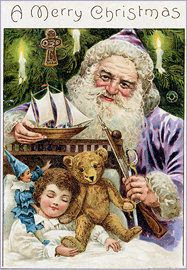
3. I decided to use a vintage photo or image from the internet. I downloaded a dozen images that I liked, and finally settled on this one:

I wanted to follow Courtney's suggestion of glueing it to coloured paper to create a frame, and settled on the blue of the harlequin doll. In fact, blue was going to be my theme for the whole project.
I turned the studio inside out, but no, I did not have any paper of that colour, so I had to make my own. (Didn't I tell you that I like to make things complicated?)
I happened to have exactly the right kind of paper for the job: some Strathmore Aquarius paper. It's thin, yet it doesn't buckle if you wet it. Pretty neat! I just covered a couple of sheets with Prussian blue, using the largest brush I own. The result was a somewhat irregular coverage, which gave it just the right look.
4. After counting the number of people I wanted to send it to -- 25 or so -- I realized I needed a tutorial on how to create a repeat pattern with Photoshop, and I found the perfect one:
https://youtu.be/qmb9vfrpGvQ
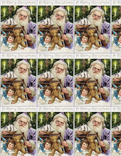
Short, and to the point. I created this letter-size sheet, and printed it three times:

5. Finding a font that I liked and could reproduce by hand was another matter. I searched and searched and finally decided on a variation of the same old one. I have no idea what it is or where I got it, but it's the kind of font that makes me smile.
I fiddled around a bit and came up with the layout on the left.

6. Another consideration was the kind of pen I would use to write on that weird textured paper. Not all pens can take the roughness, and not all inks are waterproof. This test was pretty conclusive: even though the writing looks a bit wobbly due to the texture, and the paper's high absorbency, the Sharpie was the best fit for the job.(It does bleed right after you use it, but becomes waterproof with time.)

7. It took far more time and experimenting to find the right brush for painting the single snowflake on each card. I tried about a dozen, and the only one that would hold enough paint for a whole snowflake, and had a point fine enough for the lines, was my No. 8 Escoda Perla Joseph Zbukvic that I bought in Barcelona, where they are manufactured, in 2012. According to this review, I couldn't have made a better choice.
8. The next step was to produce a sheet of snowflakes to print out for making the envelope linings. A small detail which I hoped the card recipients would appreciate, though if they did notice it they would probably think the envelopes came like that instead of being painstakinly hand-lined one by one.
I painted an 11 x 14" page of different snowflakes, dots and so on, then I scanned a section of it for the linings, and printed 12 copies -- I needed half a page per envelope.

At this point, I was ready to mass-produce my very own Christmas cards.
No comments:
Post a Comment